Ten seconds, every time
An offer has to reach a phone in a pocket, render instantly and resolve inside its window, whether the app was open, in the background or killed an hour ago.

 Currently on a team
Open to consulting
Currently on a team
Open to consulting




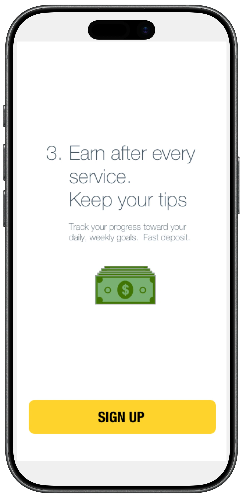
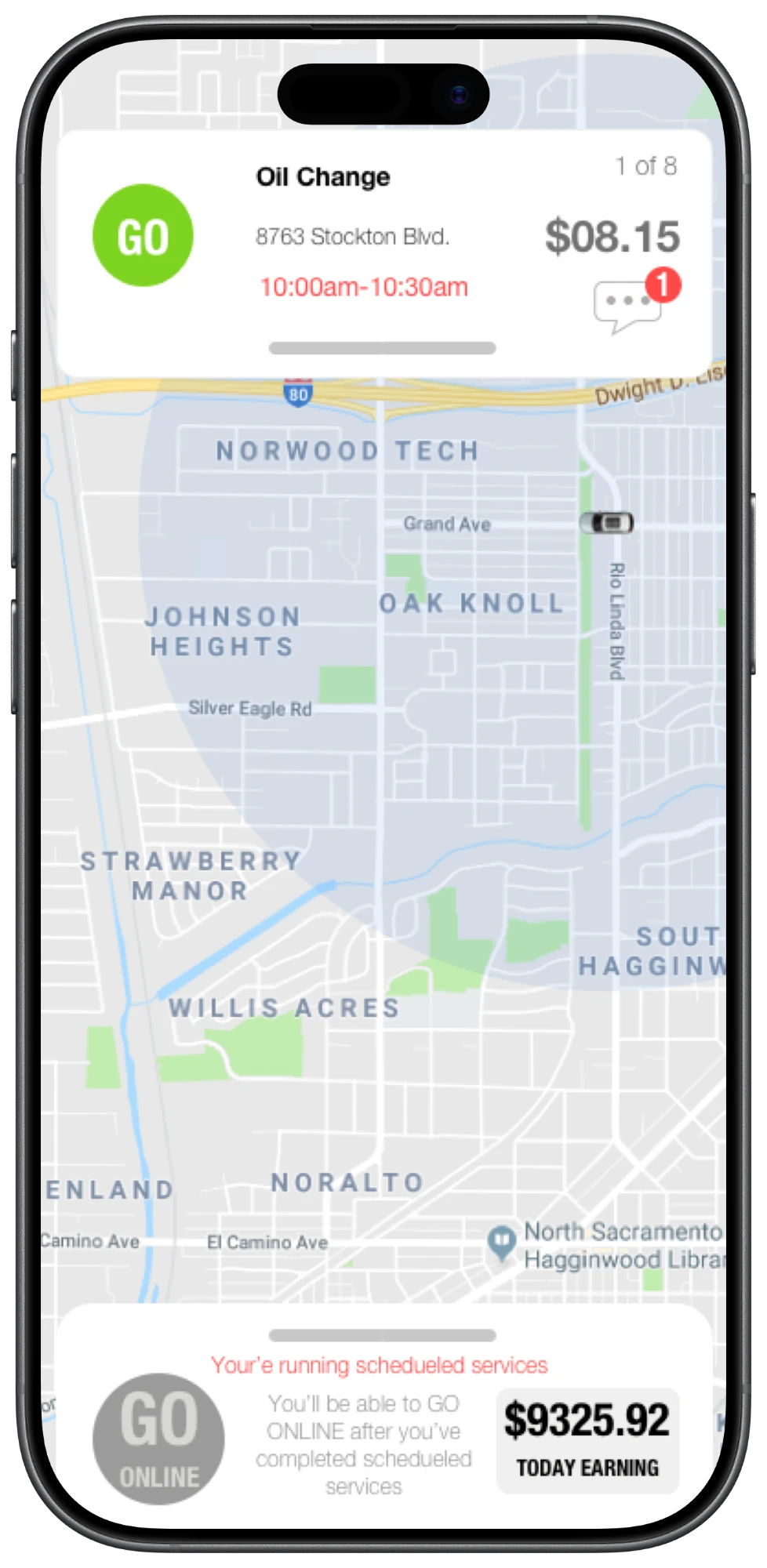
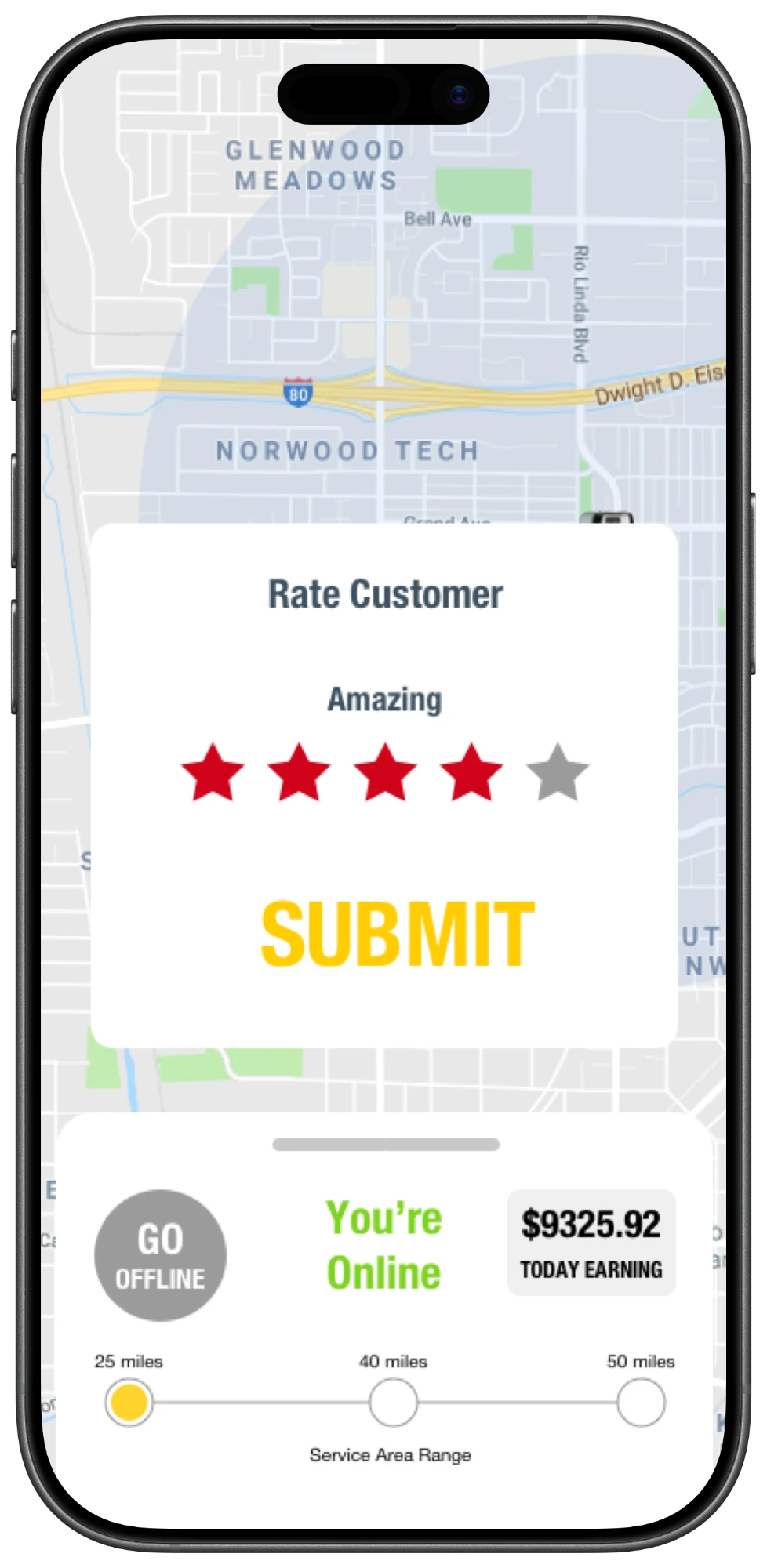
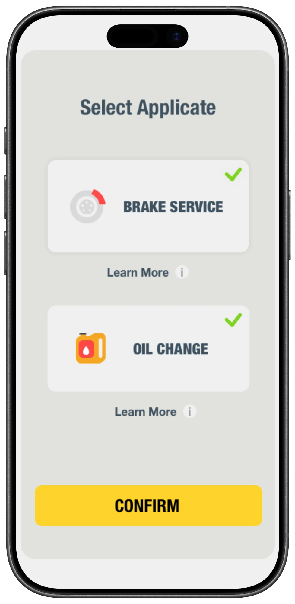
The pro app looks simple on purpose. This is the engineering that keeps it that way: the constraints, a shift screen by screen, the architecture underneath, and the problems that took the most work.
Pros use the app with one eye and one hand: driving, under a car, or between jobs. Offers expire in ten seconds, the signal drops without warning, and the app has to run for a whole shift. Those constraints set every engineering decision that follows.
An offer has to reach a phone in a pocket, render instantly and resolve inside its window, whether the app was open, in the background or killed an hour ago.
Anything that matters survives a dropped request. Actions are safe to retry, and the server always has the final word.
Push, location and a live map run all day, so battery is a budget the app has to stay inside, not an afterthought.
Four moments from a pro’s day. Every numbered detail is outlined on the screen. Hover one to find it.
Step 1 of 4 · Services
Pros opt in to the services they’re equipped for, and only those turn up as offers later.
Step 2 of 4 · Booked jobs
A pro with bookings works through them before taking on-demand requests. The day comes one card at a time.
Step 3 of 4 · The offer
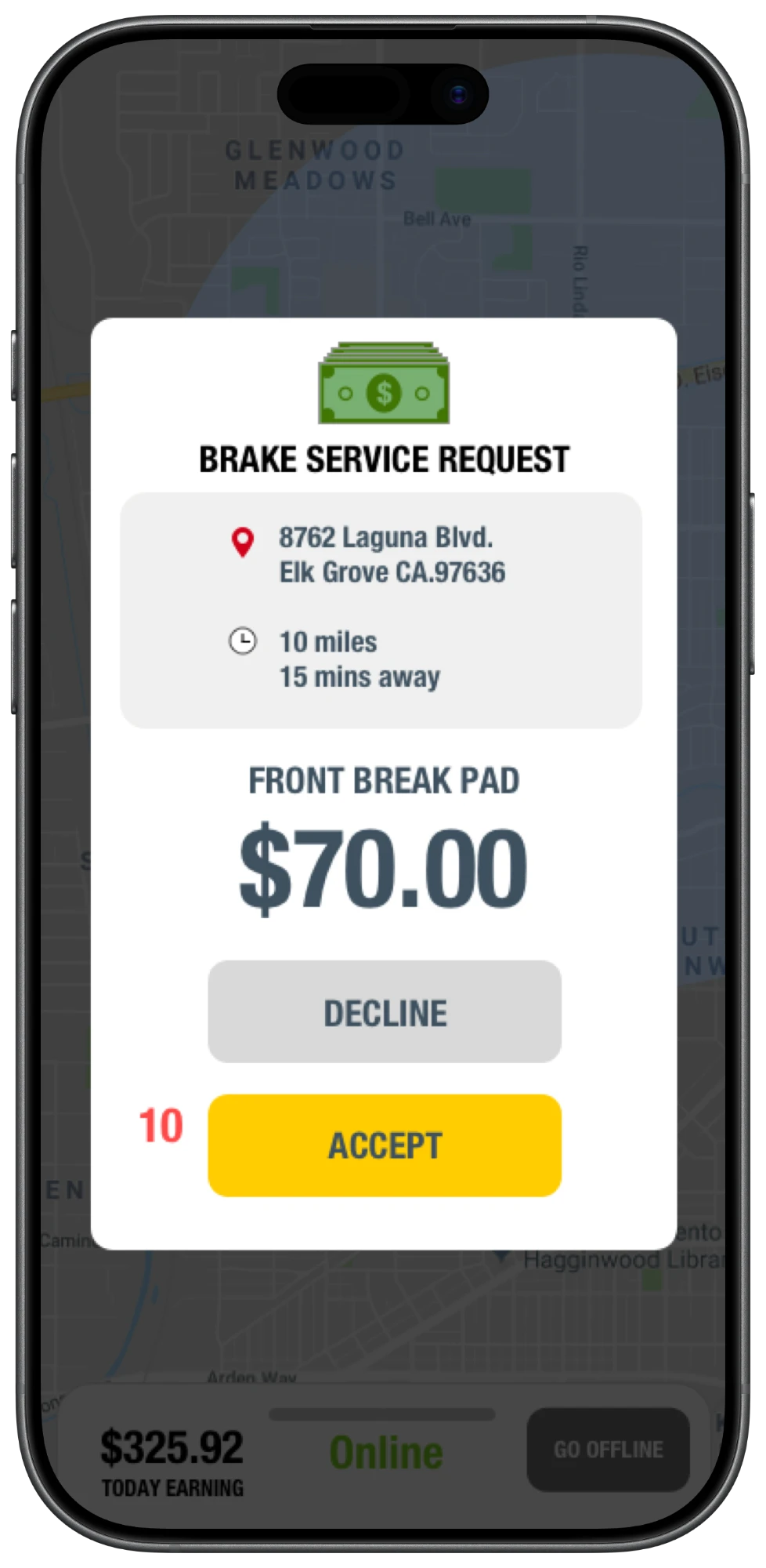
A request slides up over the map with everything needed to decide, plus a clock.
Step 4 of 4 · Wrap-up
When a job ends, rating the customer is a single tap, and the pro never leaves the online state to do it.
Every screen in the walkthrough is a view of the same thing: where the pro is in their shift. Modelling that as a single state machine meant every edge case had exactly one answer, whether an offer landed mid-schedule, a job was cancelled en route, or the app was killed halfway through.
UIKit throughout, with MapKit for the map and service radius. One bottom-sheet container is reused by every state.
One object owns the pro’s availability. Screens render from it and ask it to change; none of them decide on their own.
Offers arrive by push so they reach a phone in a pocket. Accept isn’t final until the server confirms it.
An offer crosses three systems in under ten seconds: the server that issues it, the push that carries it, and the phone that has to decide. The demo runs on the real timing; tap Accept or Decline to see what happens.
Brake service · 10 miles · $70.00
An offer is on its way…
The server matches the booking to an online pro by service and radius, and stamps the offer with an expiry time. From here on, that timestamp is the only clock.
A push carries the offer to the phone, whether the app is open, backgrounded or killed, and it opens straight over the map.
Distance, drive time and payout on one screen. The ring counts down to the server’s deadline, not a timer of its own.
Accept goes to the server, which gives the job to exactly one pro, and the customer sees who’s coming and when. Decline, or let the clock run out, and the offer moves straight to the next pro. Nobody waits on a silent phone.
Four problems took most of the engineering: offers expiring in transit, accepts racing each other, booked jobs colliding with on-demand work, and live location without the battery drain.
The pro app shipped on the App Store as the working half of the Helpros marketplace, alongside the customer app. I owned it from architecture through release.
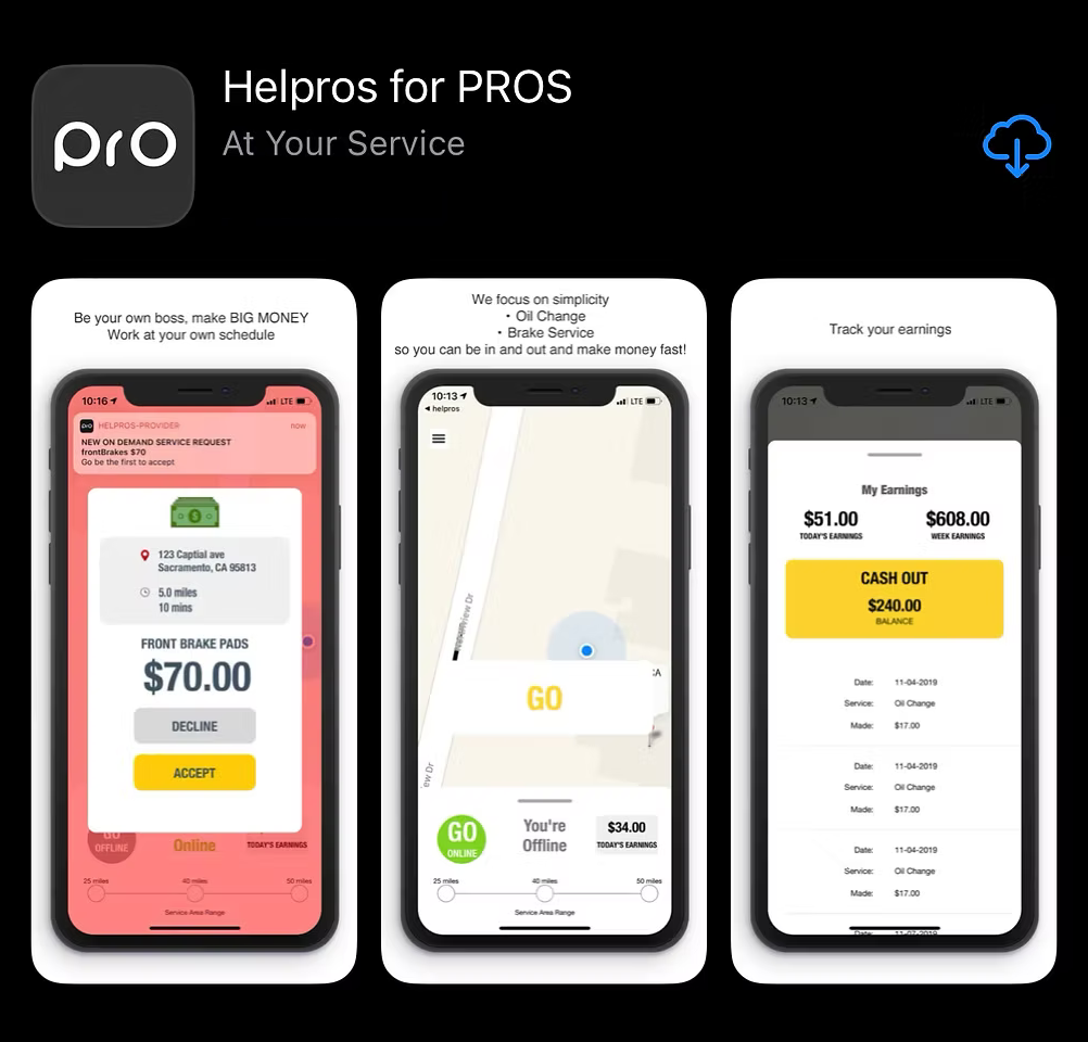
Availability as one state machine. Every new edge case became a question about a transition, not another flag scattered across screens.
A persistent connection alongside push for foreground offers. Push was the right backbone for a phone in a pocket, but an open app could hear about an offer, or its cancellation, a beat sooner.
Design for the worst network first. I start every feature by asking what happens on one bar of signal with the app killed, then build the happy path on top.
I’m happy to walk through the architecture, the trade-offs and the code behind any of this.
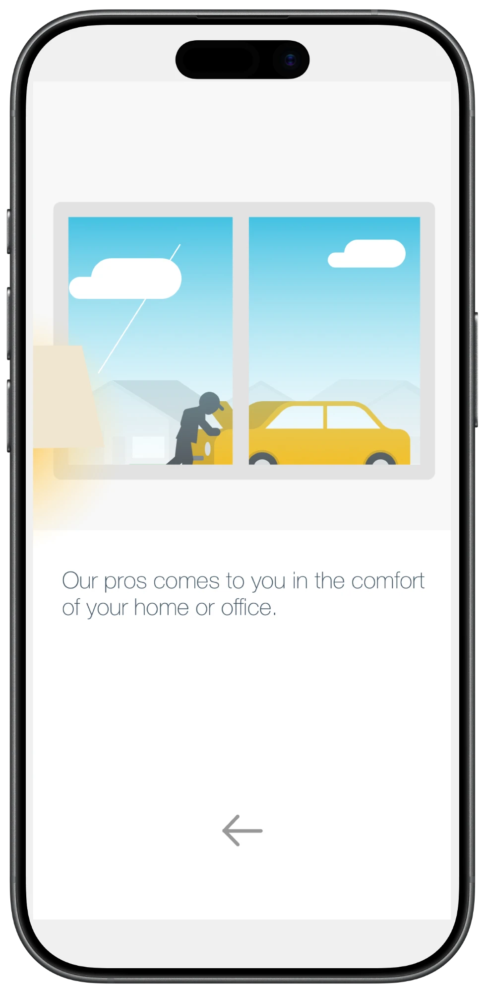
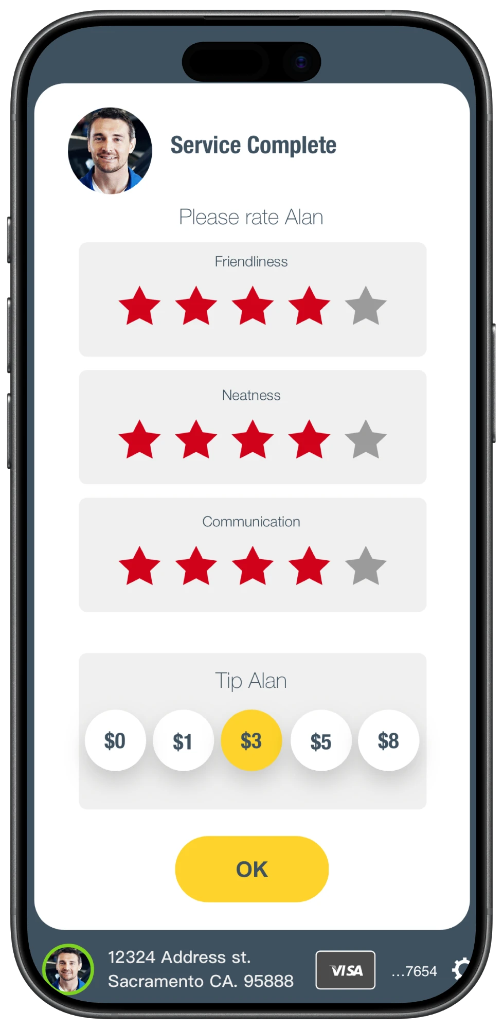
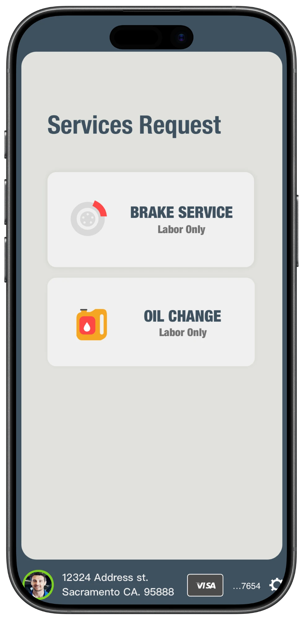
Four moments from the customer’s side of a job. Every numbered detail is outlined on the screen. Hover one to find it.
Step 1 of 4 · Services
The address and card are set once and stay pinned, so choosing a service is the only decision on the screen.
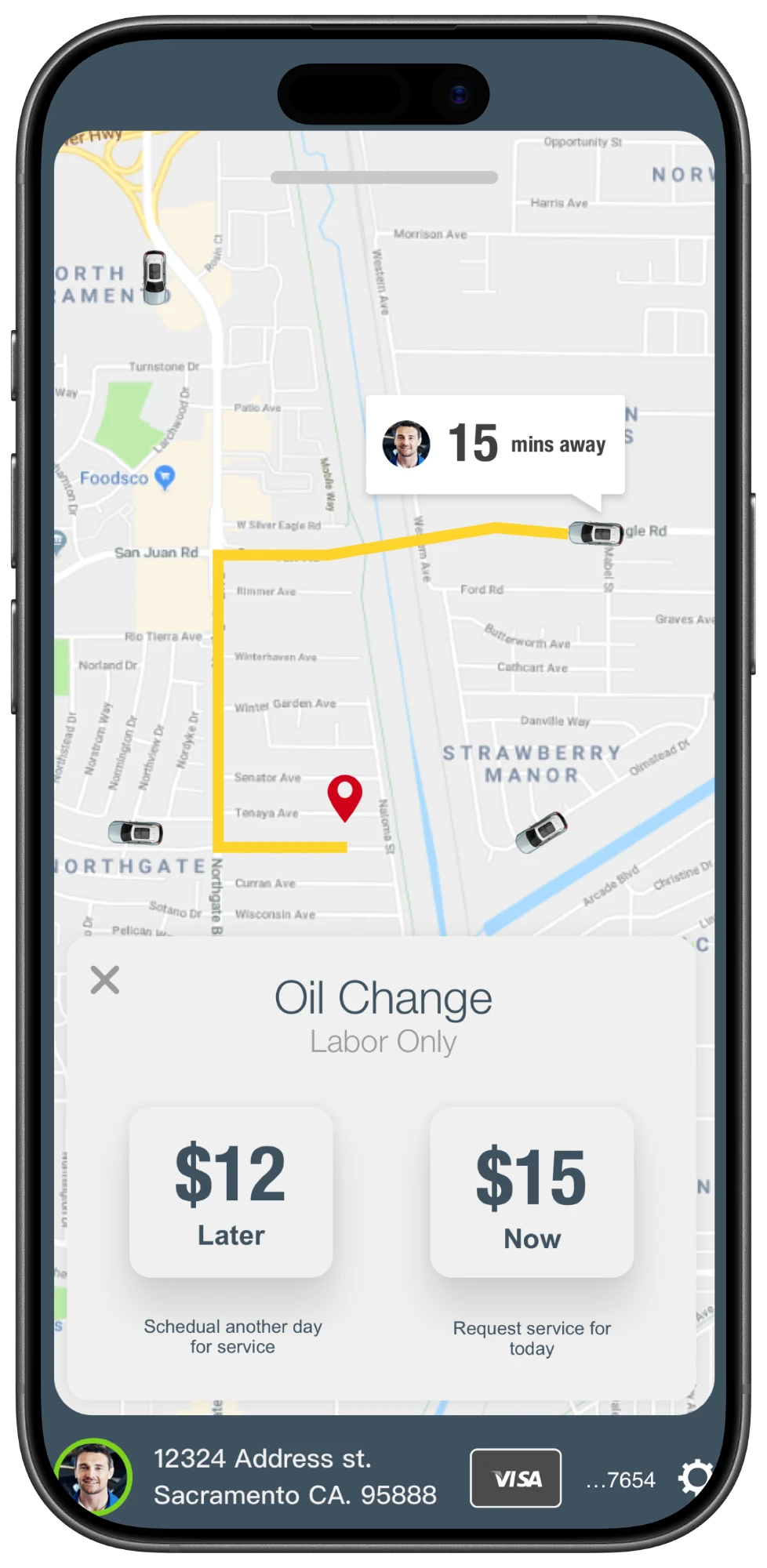
Step 2 of 4 · Now or later
Picking a service opens the map, with the nearest pro’s route already drawn and two prices to choose from.
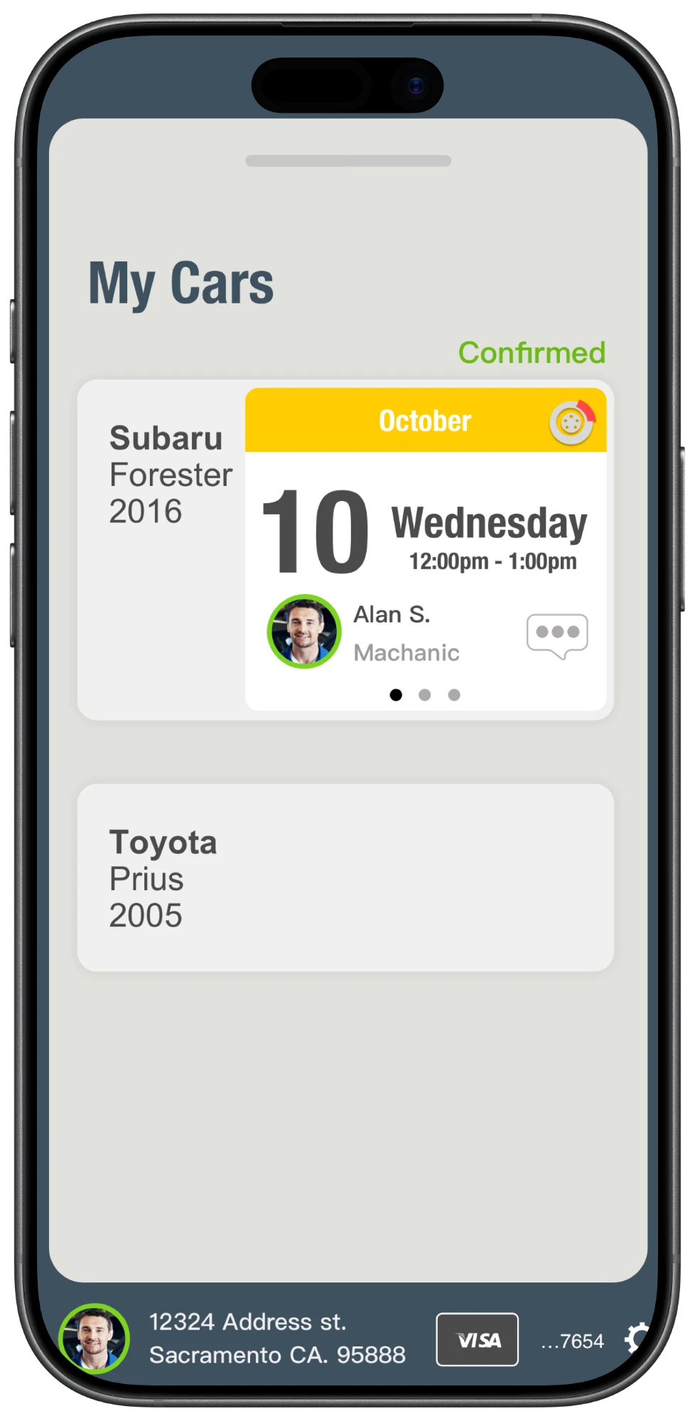
Step 3 of 4 · Booked
Bookings sit under the car they’re for, so a household with two cars can see at a glance which one is booked.
Step 4 of 4 · Wrap-up
When the job is finished, rating the pro and tipping share one screen, with nothing to type.
The customer app is one half of the marketplace. Every step here is answered by a step in the pro app, and I built both sides of each hand-off.
Customer: Taps Now for a service today.
Pro: Gets a live offer, with ten seconds to accept.
Customer: Books another day, for less.
Pro: Finds it in scheduled jobs, ahead of on-demand work.
Customer: Sees who’s coming, and a live drive time.
Pro: Shares precise location only while en route.
Customer: Messages from the booking.
Pro: Replies from the same job card.
Customer: Rates the pro and tips in one pass.
Pro: Rates the customer, and stays online.
The customer app shipped on the App Store as Helpros, alongside Helpros for PROS. Its listing shows the three moments the app was built around: booking, rating and tracking.
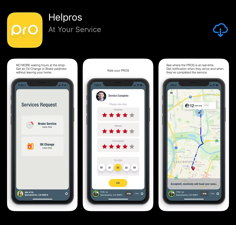
I’m happy to walk through how the two apps fit together, and the code behind them.
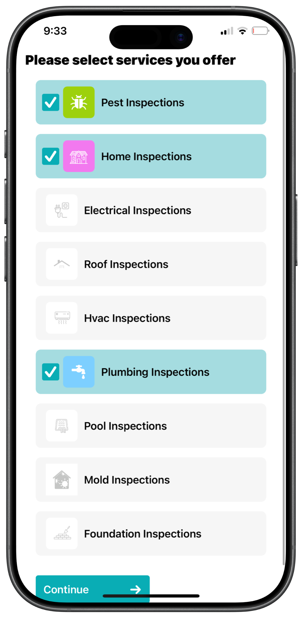
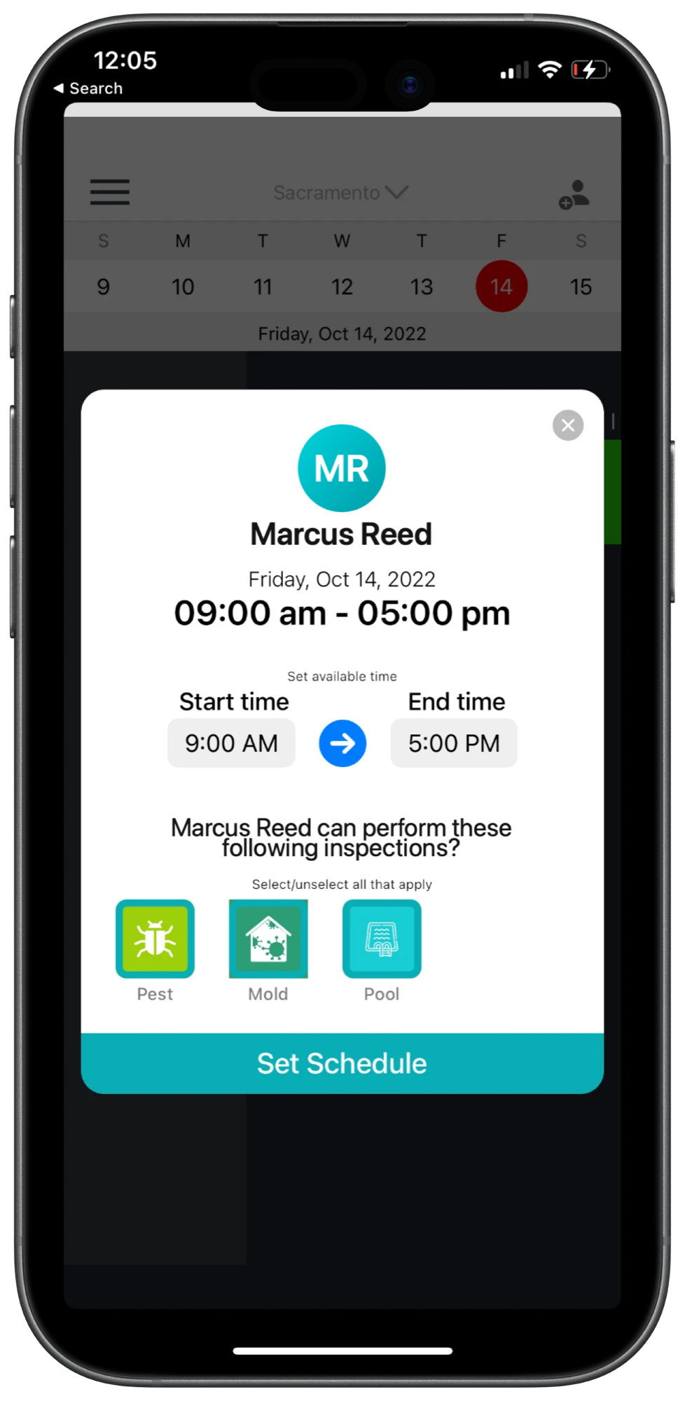
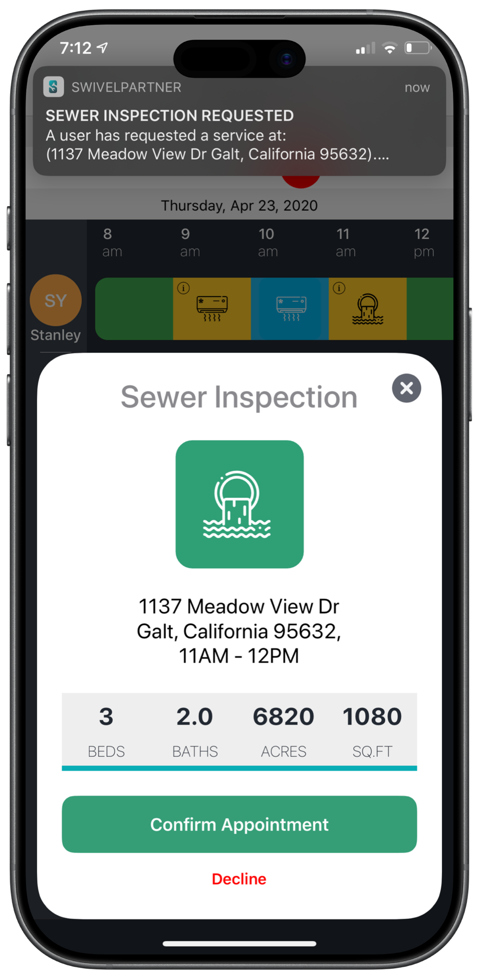
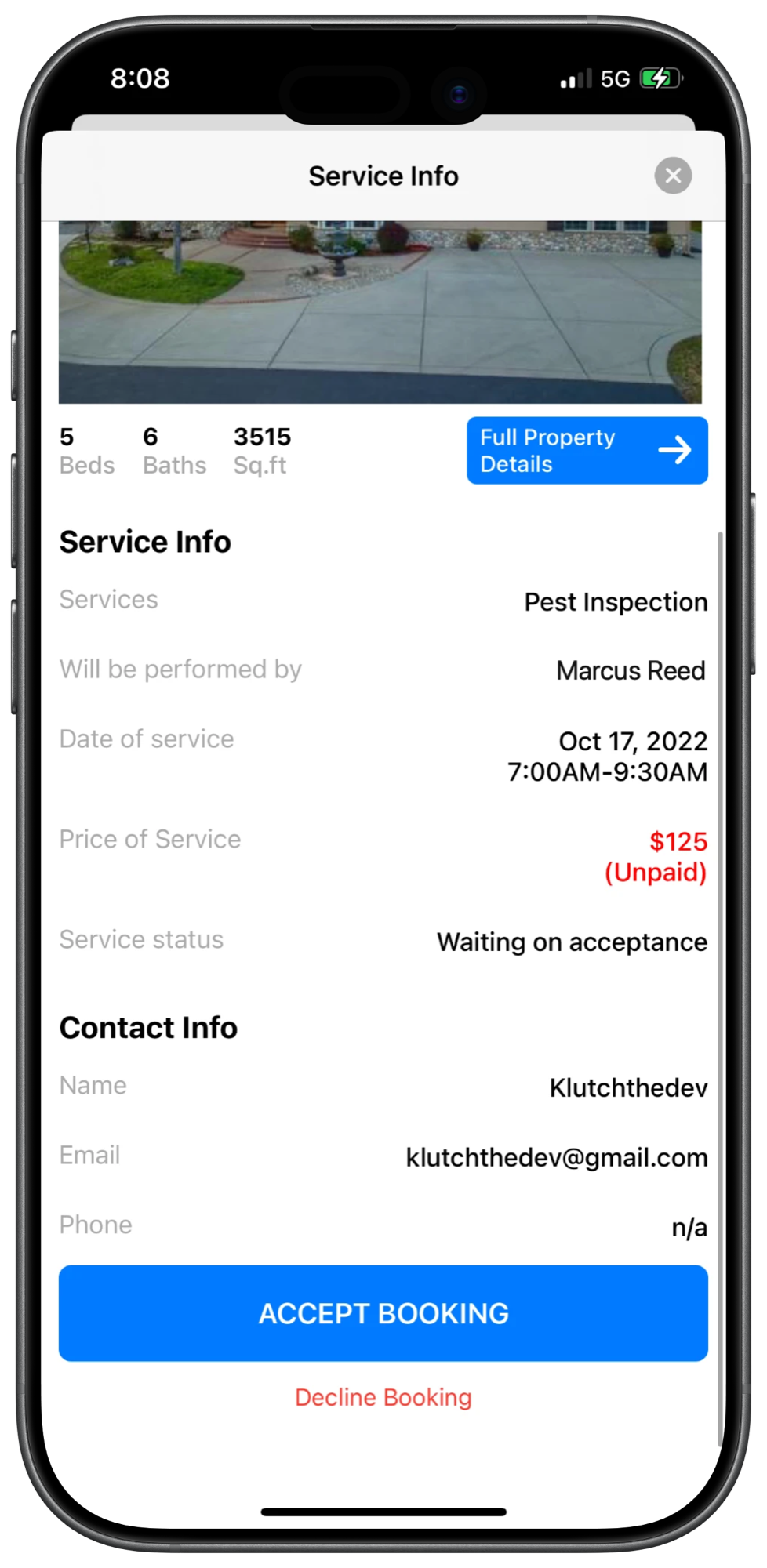
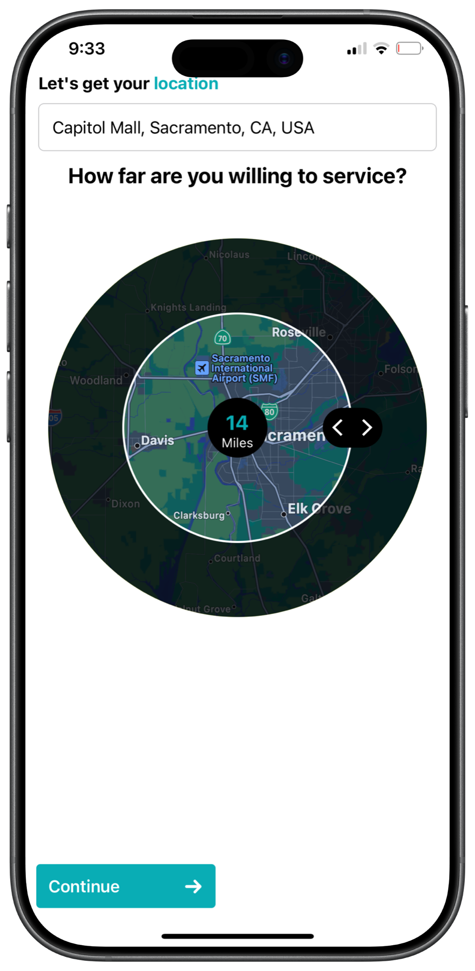
Six screens, from an empty account to a job on the calendar. Every numbered detail is outlined on the screen. Hover one to find it.
Step 1 of 6 · Services
Nine inspection types, and a company ticks the ones it does. That list decides everything an agent can ask them for.
Step 2 of 6 · Service area
Inspectors travel, but not everywhere. The area is an address and a number of miles, not a shape to draw.
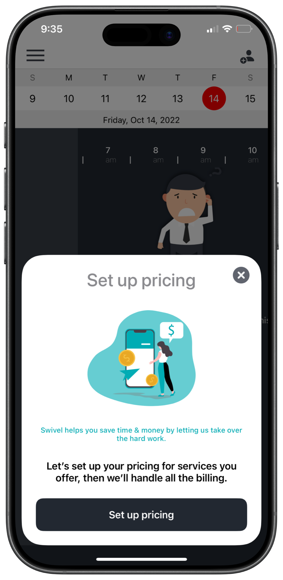
Step 3 of 6 · Pricing
Pricing is per service, then by property type and size. After this, an agent’s quote is a lookup rather than a phone call.
Step 4 of 6 · People
A company is rarely one person. Each employee gets their own hours and their own set of inspections.
Step 5 of 6 · The request
When an agent books, the slot is held straight away and the company hears about it on their phone.
Step 6 of 6 · The booking
The booking holds everything the job needs: the property, who is doing it, what it costs, and whether it has been paid.
The company app is one half of Swivel. Agents work in the other one, and what they book is priced and scheduled from what companies set up here.
An agent adds the property they’re selling. Public records fill in the type, the size, the systems and the rooms, so nothing has to be typed twice.
Each company’s pricing model turns the property into a quote, and their calendar turns the day into times. The agent picks from real prices and real openings.
Booking writes the appointment onto the company’s day and pushes it to them. Nothing double books while they decide.
Accepting confirms the job. Declining releases the slot and sends the agent back another option, without a call.
Payment is an invoice to whoever is covering it, the buyer or the agent, and the company is told when it clears.
An inspection that isn’t paid before its date is cancelled, so a slot is only ever held for work that is actually happening.
Swivel Partner shipped as the company half of Swivel. Its App Store previews run the same path as the walkthrough above: choose services, set pricing, then watch the bookings arrive.
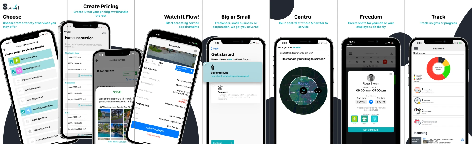
I’m happy to walk through the pricing model, the scheduling, or how the two sides hand off.
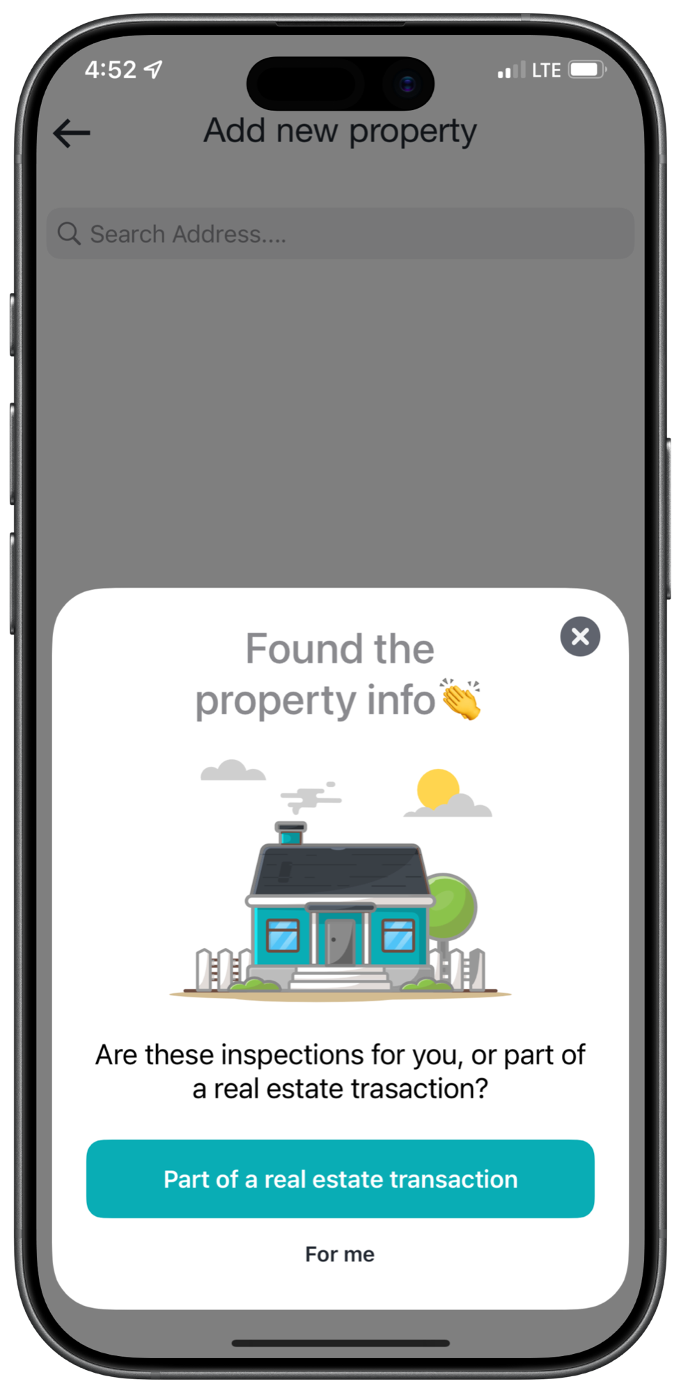
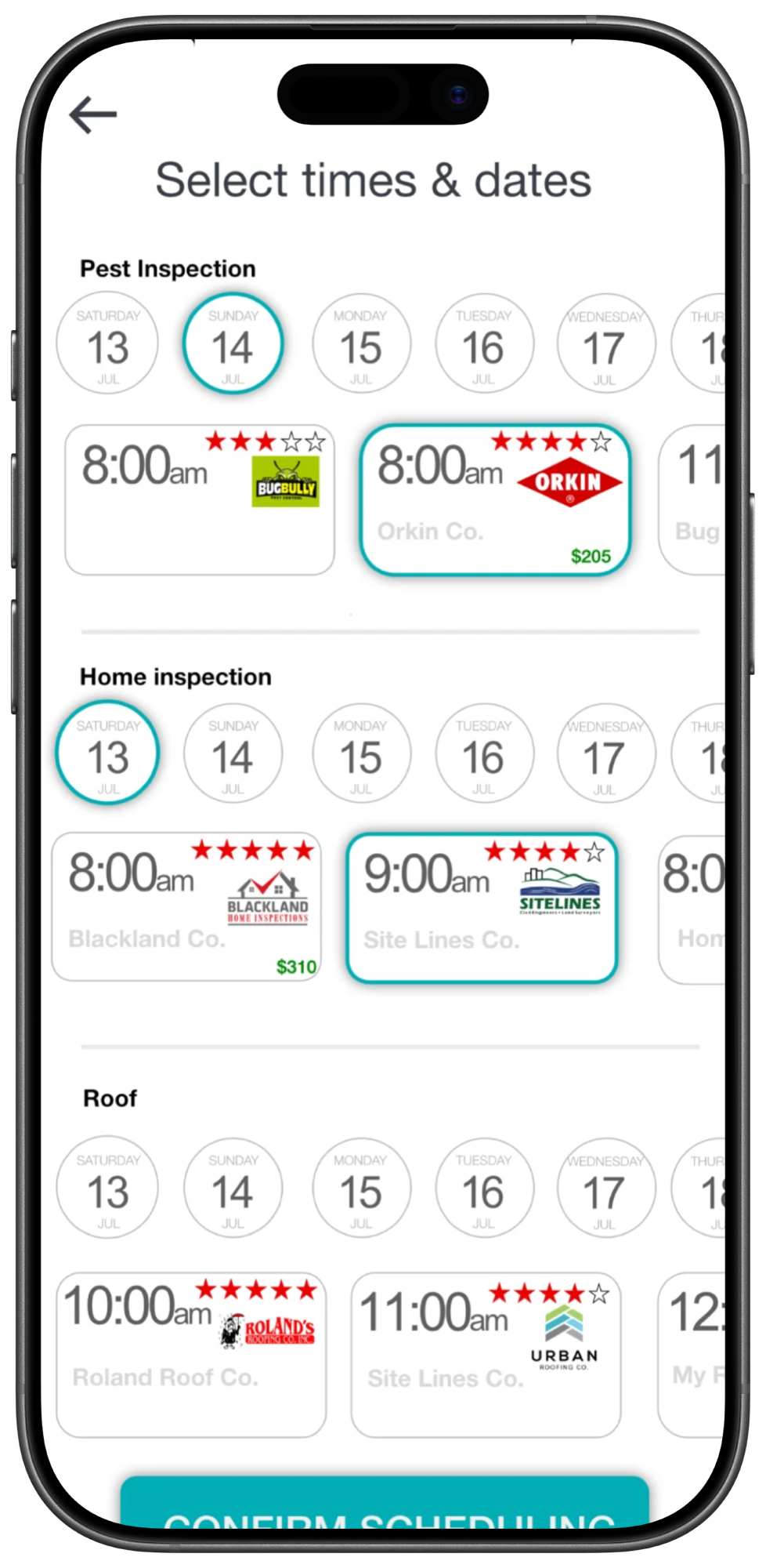
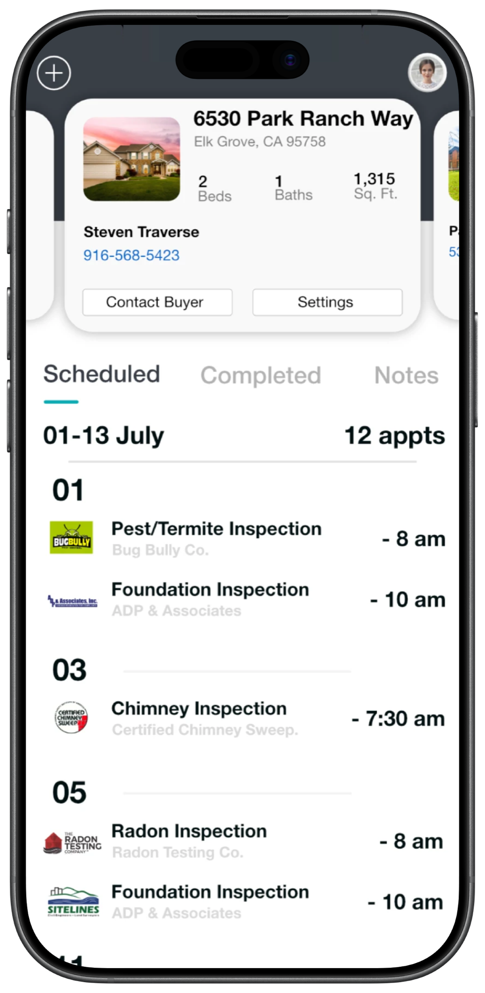
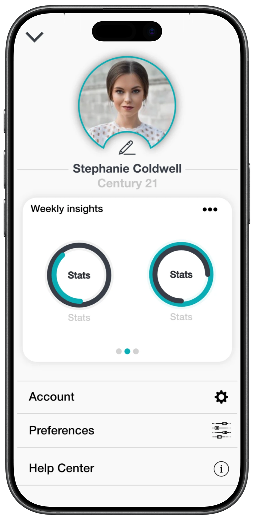
Four screens, from typing a street name to a property with its inspections on the calendar. Every numbered detail is outlined on the screen. Hover one to find it.
Step 1 of 4 · The address
An agent types the address they’re selling. The app goes and finds the property before asking anything else.
Step 2 of 4 · The property
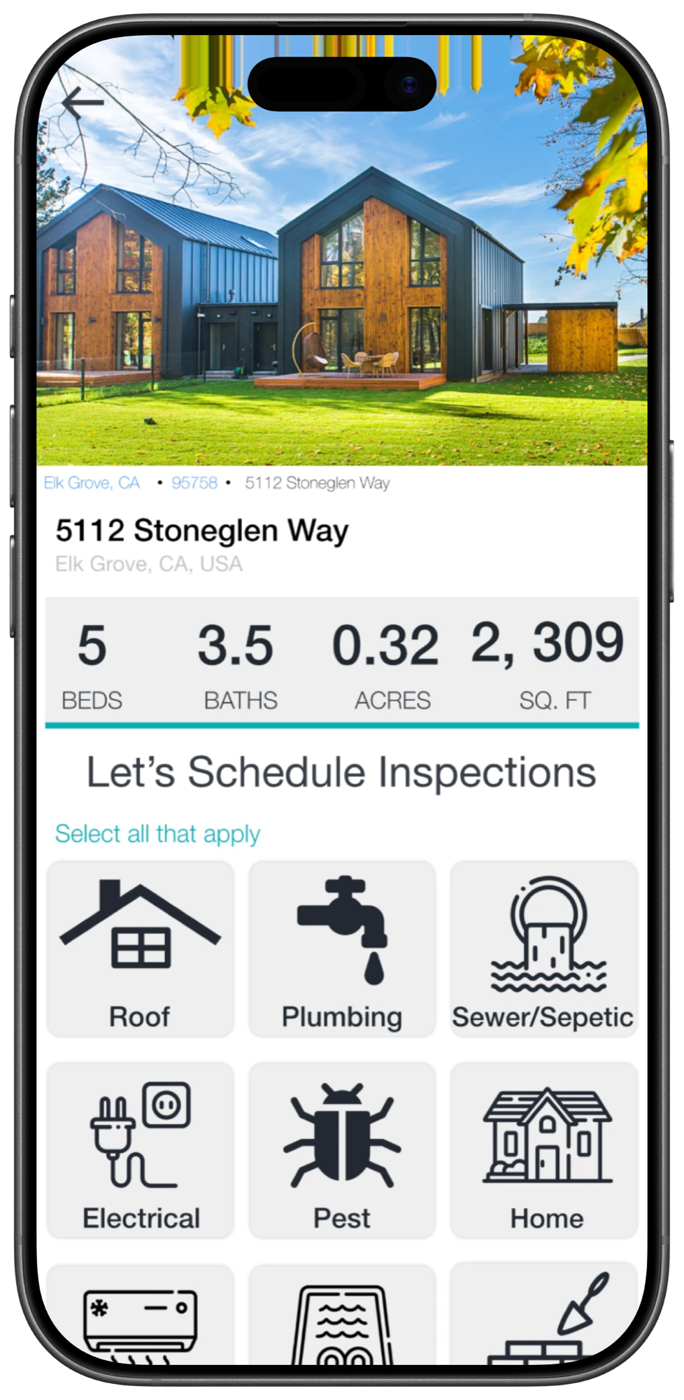
The property comes back with its own photos and numbers, and the inspections sit right underneath it.
Step 3 of 4 · Times
This is the screen the whole product exists for. Each inspection gets its own days and its own openings, from the companies that cover this address.
Step 4 of 4 · The deal
After booking, the property is the file: who is coming, when, and who to call about it.
Swivel only works because the other side is already set up. Every choice an agent makes here is answered by something a company published in Swivel Partner.
Agent: Picks the inspections a deal needs.
Company: Only shows up for the services it offers.
Agent: Sees a price on every slot.
Company: Set that price once, by property type and size.
Agent: Picks a day and a time.
Company: Published those hours as an employee’s shift.
Agent: Books, and the slot is held.
Company: Gets a push, and accepts or declines.
Agent: Pays, or sends the invoice to the buyer.
Company: Is told when it clears, through Stripe.
I’m happy to walk through the property lookup, the scheduling, or the company app it books into.
A press conference an athlete can hold whenever they want, out of questions that arrived while they were asleep.
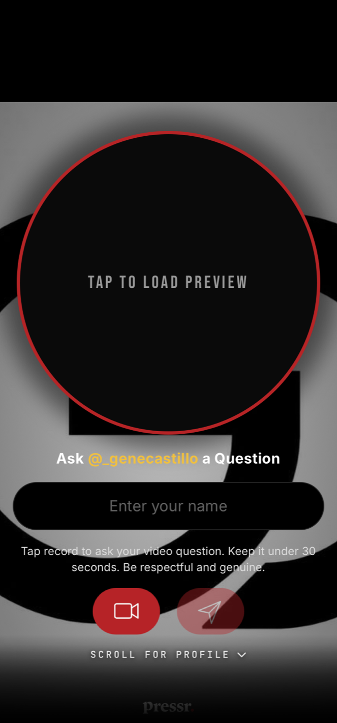
Step 1 of 6 · The portal
A fan, a scout or a recruiter records a video question on the athlete’s public profile. They can attach money to it, or just send it.
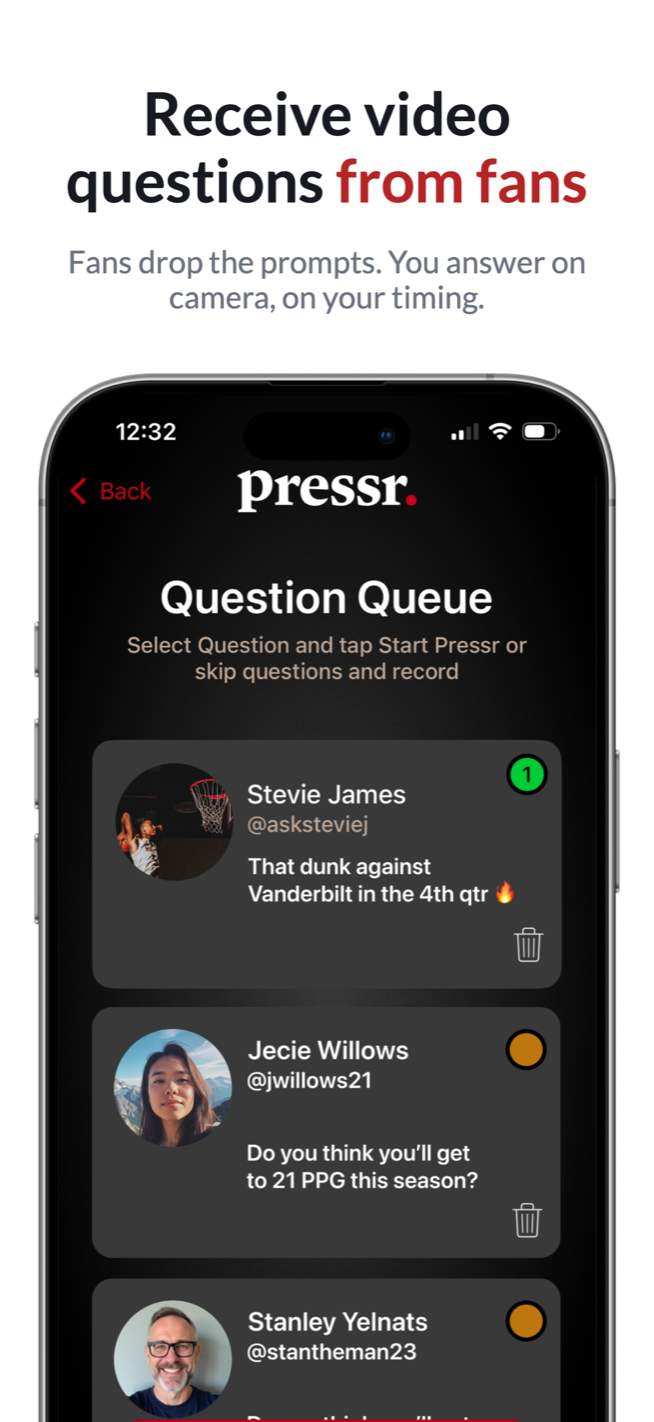
Step 2 of 6 · The queue
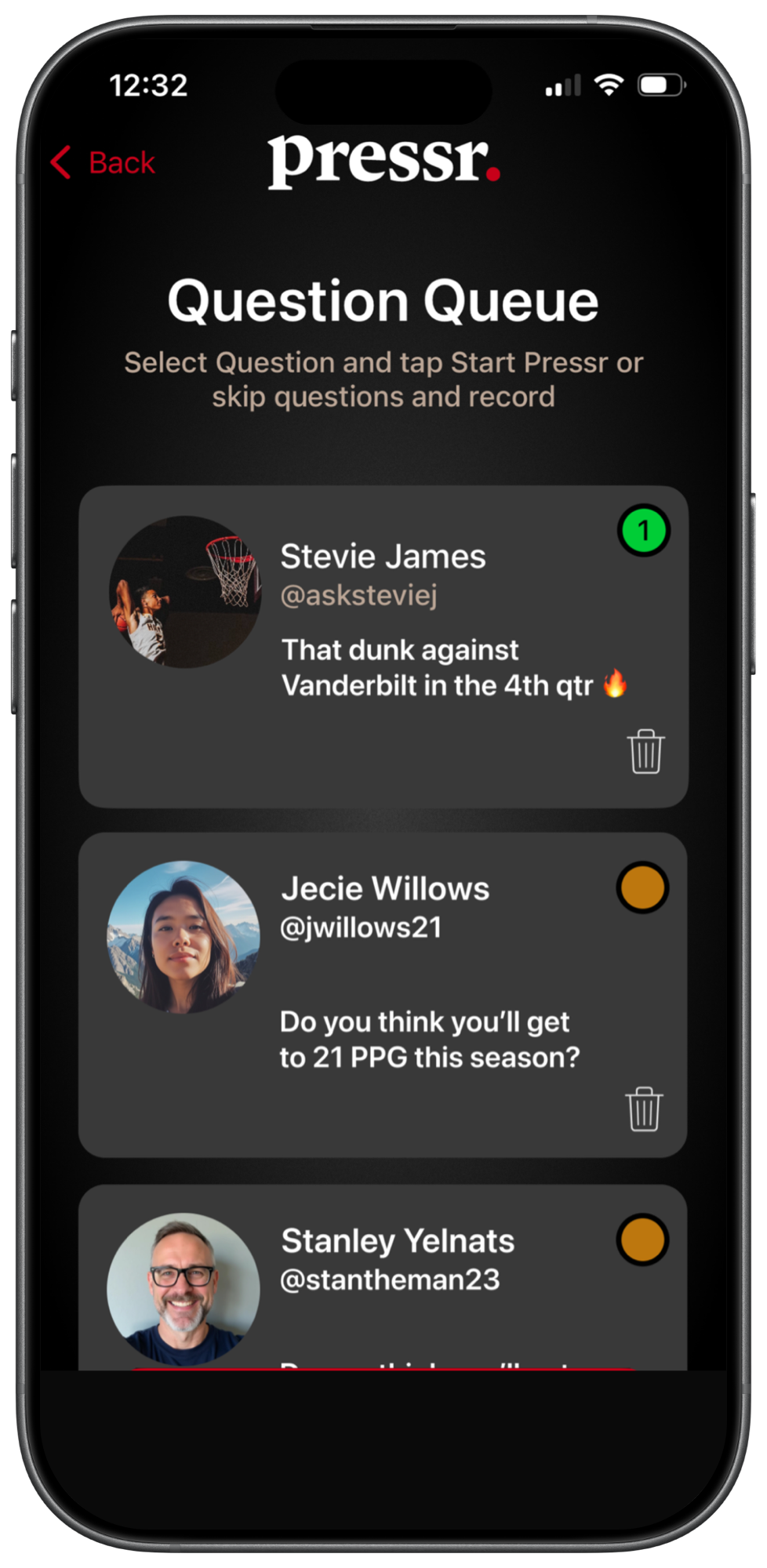
Everything lands in the app, paid and unpaid together, waiting for the athlete to be in the mood to talk. They pick the ones worth answering and hit Start Pressr.
Step 3 of 6 · On the mic
“First question” puts one on screen and reads it aloud, the athlete answers, “next question” moves on. The phone stays on its stand the whole time.
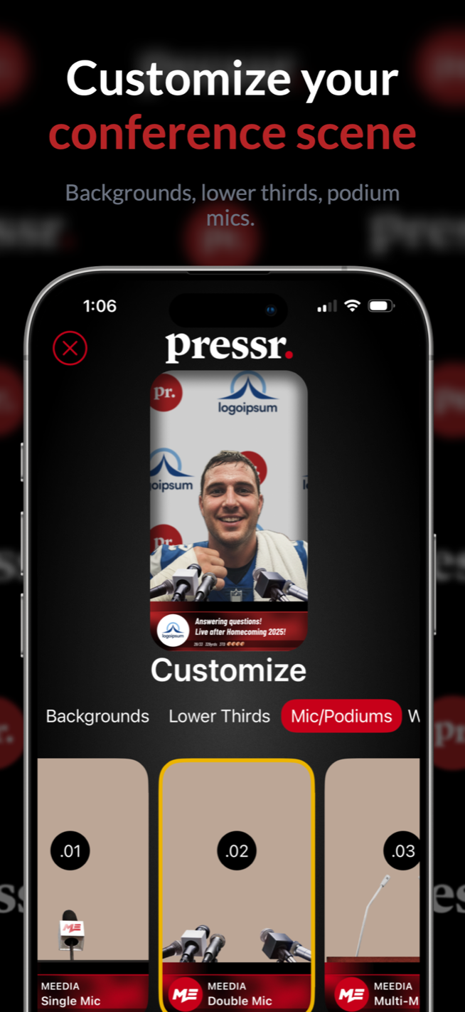
Step 4 of 6 · The look
Backdrop, mic, podium, lower thirds and a chiron, all chosen at the end, so every pressr comes out looking like the same show.
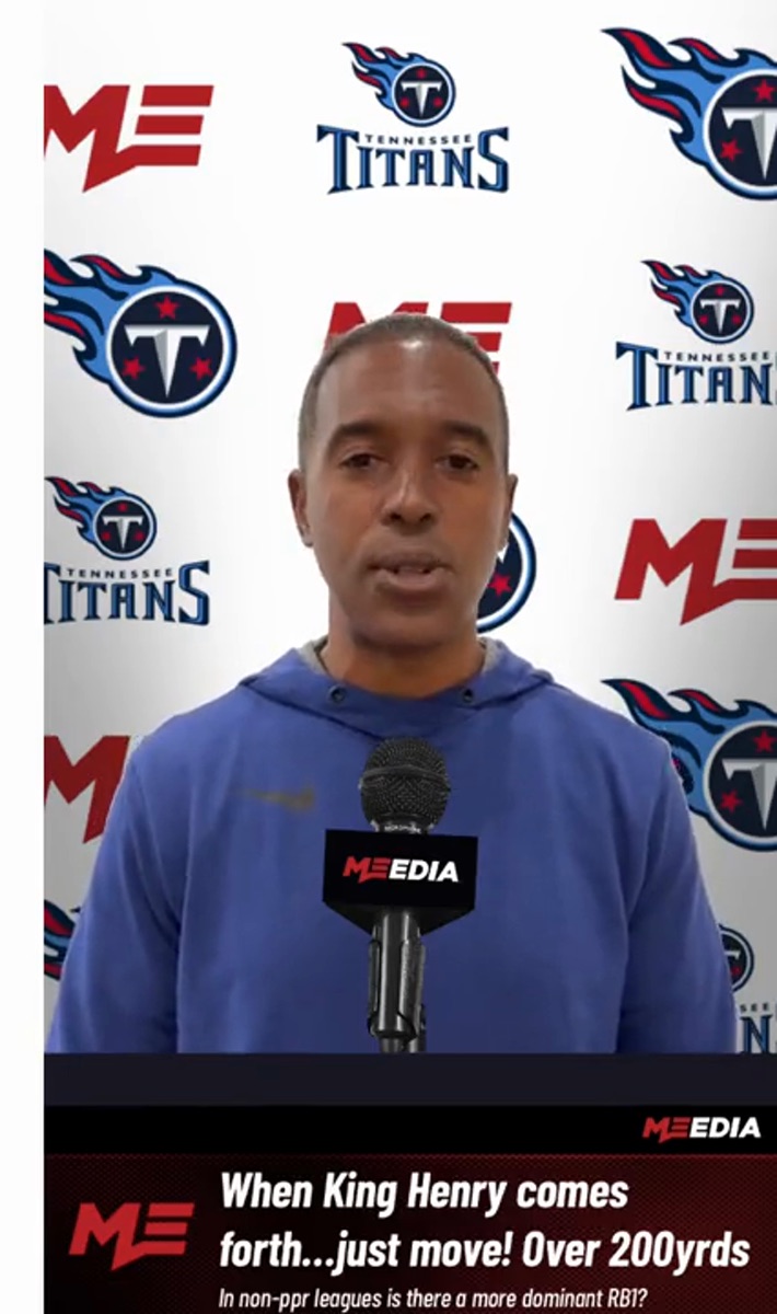
Step 5 of 6 · Render
As each answer renders, the question’s own video drops into the top right, then clears, so you see who asked and the athlete answering them.
Step 6 of 6 · Payout
Money attached to a question is released once it is answered, and Stripe moves it to the athlete’s bank.
A pressr is the loud part. The profile behind it is what a recruiter actually reads, so the app carries the evidence too.
Season numbers kept on the profile, managed from the app rather than retyped into a message thread.
Game film and training clips uploaded straight from the phone, so the gallery on the public page stays current.
Bio, measurables, highlights, team and schedule on one link, which is the thing a recruiter actually opens.
Recruiting runs on self-reported numbers. The Combine measures them with the phone instead and flags the result as verified, so a coach knows where the figure came from. Push-ups are the metric that ships today; the vertical and the 40 run through the same scanner.
The front camera runs Vision body pose on every frame, with depth from the TrueDepth camera alongside it, so the app is tracking a skeleton rather than pixels.
Before counting starts, it checks you are genuinely in a plank, using the depth gap between hips and shoulders, then learns your own top and bottom elbow angles.
A rep is a state machine with hysteresis and a dwell time, not a single threshold. Anything short of your calibrated depth still counts, but is recorded as a partial.
Framing hints when you drift out of frame, tones at the top and bottom of each rep, and a haptic on every count, so nobody has to watch the screen while they work.
These are the App Store previews the app ships with today. They cover the whole loop: record a pressr, take questions from fans, customise how it looks, and publish it to a profile.
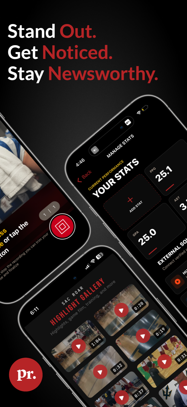
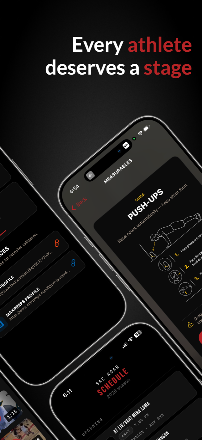
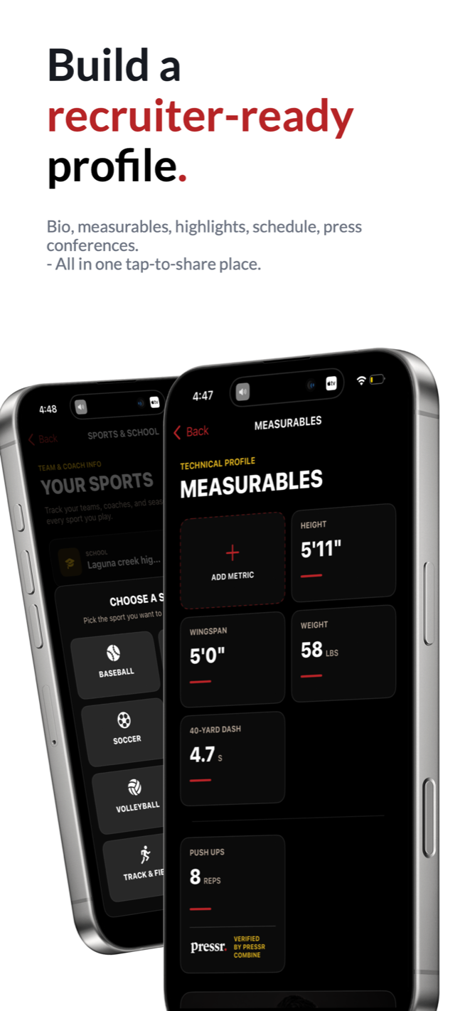
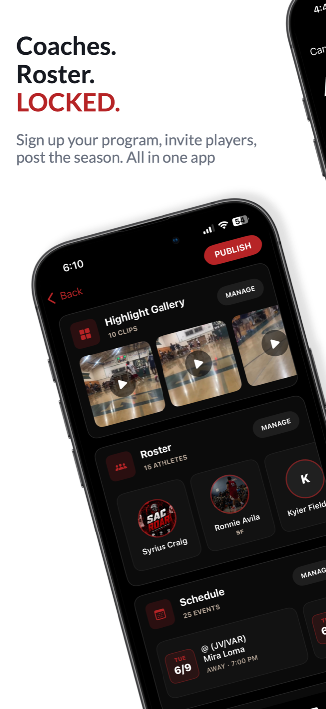
Pressr first shipped in July 2015 as MEedia and is still being updated: version 3.1.0 landed in June 2026, adding stats management, highlight uploads and team mode. It is the one project on this page you can still download.
The profiles it publishes are public, so the output is easy to check: pressr.app/_genecastillo is an athlete, and pressr.app/sacroar is a club, with its roster and season.
I’m happy to walk through the recorder, the overlays, or how a pressr gets published.

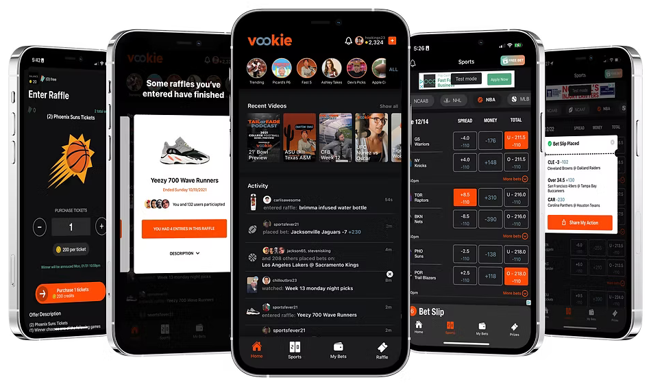
The whole product is one loop, and a user never puts money into it.
A rewarded ad hands back credits. That is where every stake comes from, which means the advertiser funds the action rather than the user.
Those credits go on the actual board: spread, moneyline or total, as a single or a parlay, priced like any sportsbook.
A winning slip pays out more credits, and credits buy entries into the raffles running in the app.
Game tickets, sneakers, gift cards. The draw happens in the app with everyone who entered watching, so the payoff is something you can hold.
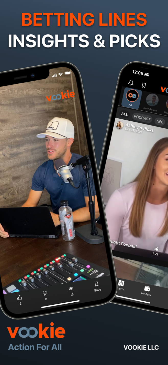
Five screens, from an ad that pays for a bet to a raffle being drawn. These are the App Store previews the app shipped with.
Step 1 of 5 · The feed
Home is people, not fixtures: podcast clips and picks from creators, with an activity feed of what everyone else is betting, watching and entering. The rewarded ads live here too, and each one is another free bet.
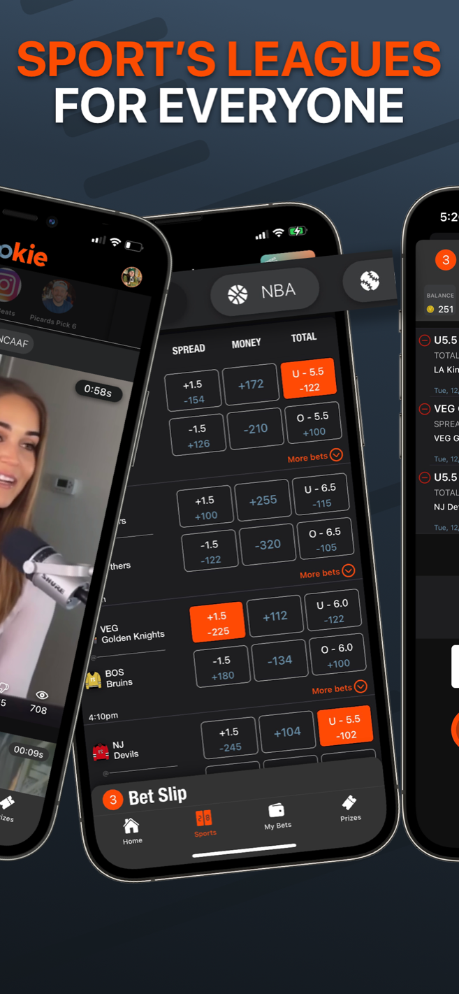
Step 2 of 5 · The board
Every league on one board, with spread, moneyline and total per game, and the same layout a sportsbook uses so nobody has to learn it twice.
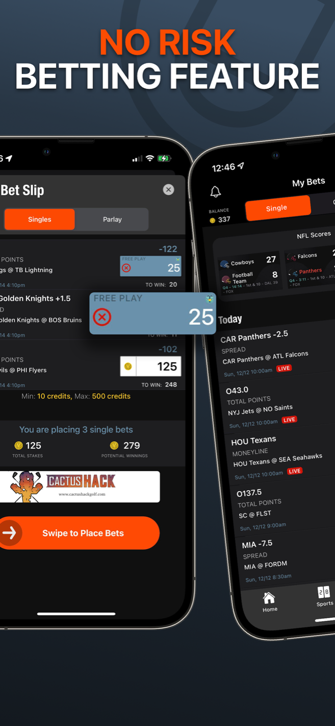
Step 3 of 5 · The slip
Singles or a parlay, staked with the credits those ads earned, 10 to 500 a slip, free plays applied on top, and a swipe to place rather than a button you can fat-finger.
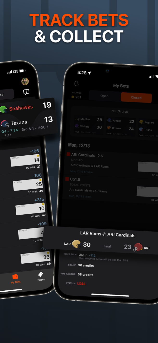
Step 4 of 5 · The night
Open and closed bets sit against live scores, so a slip is something you follow through the evening rather than check once in the morning.
Step 5 of 5 · The payoff
This is where free money becomes a real thing: winnings buy raffle tickets, each raffle with a countdown and an entry cap, and the draw plays out in the app. That is the clip here.
A slip, a picks list or a raffle result renders as a branded card, sized for a story, with the App Store badge already on it. Sharing it is one tap into Instagram, and that card was how new users found the app.
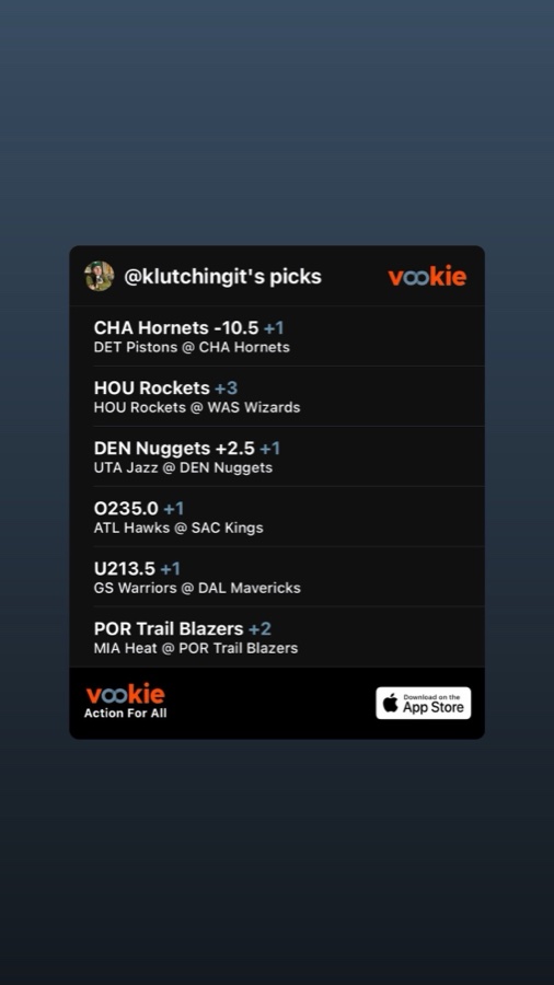
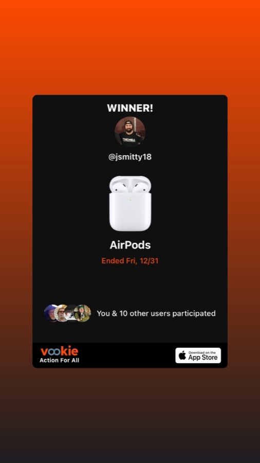
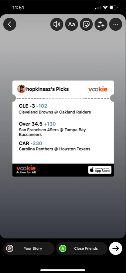
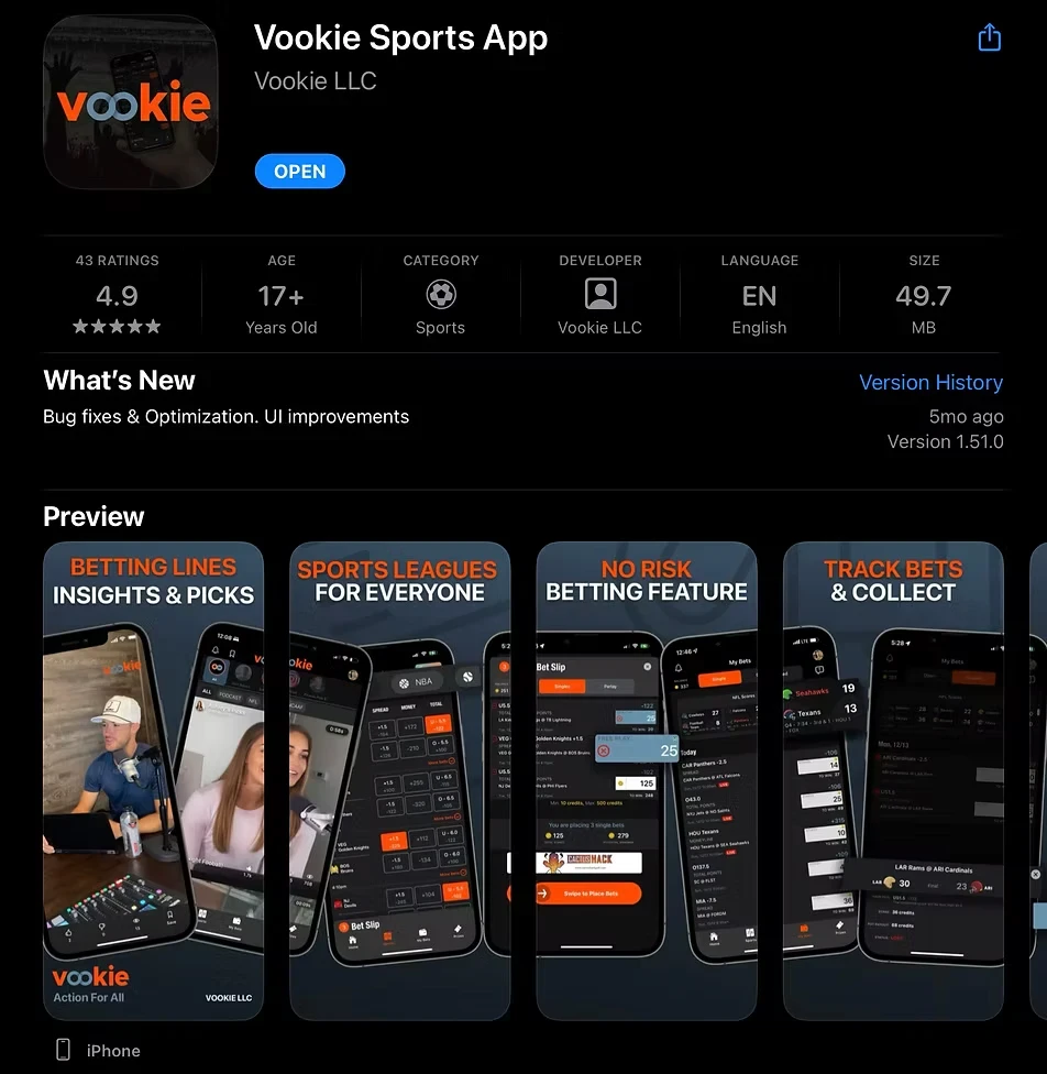
Vookie shipped on the App Store under Vookie LLC, rated 17+ in Sports, with the five previews above on its listing. It reached version 1.51.0, and this is the listing as it stood.
I’m happy to walk through the feed, the slip, or how the raffle draw was built.

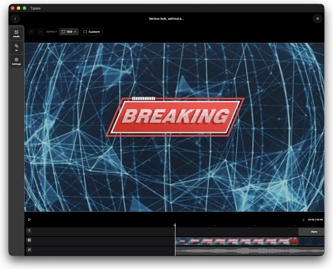
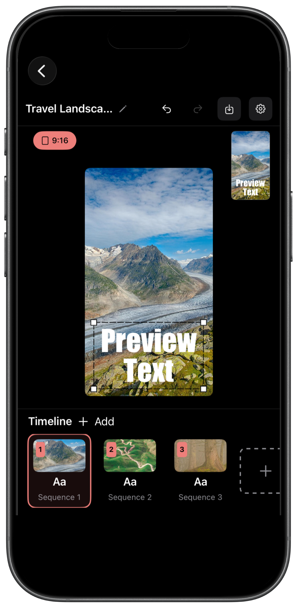
Each one is shown by the ad I cut for it. The caption is the engineering underneath, not the pitch. The clips play as you reach them.
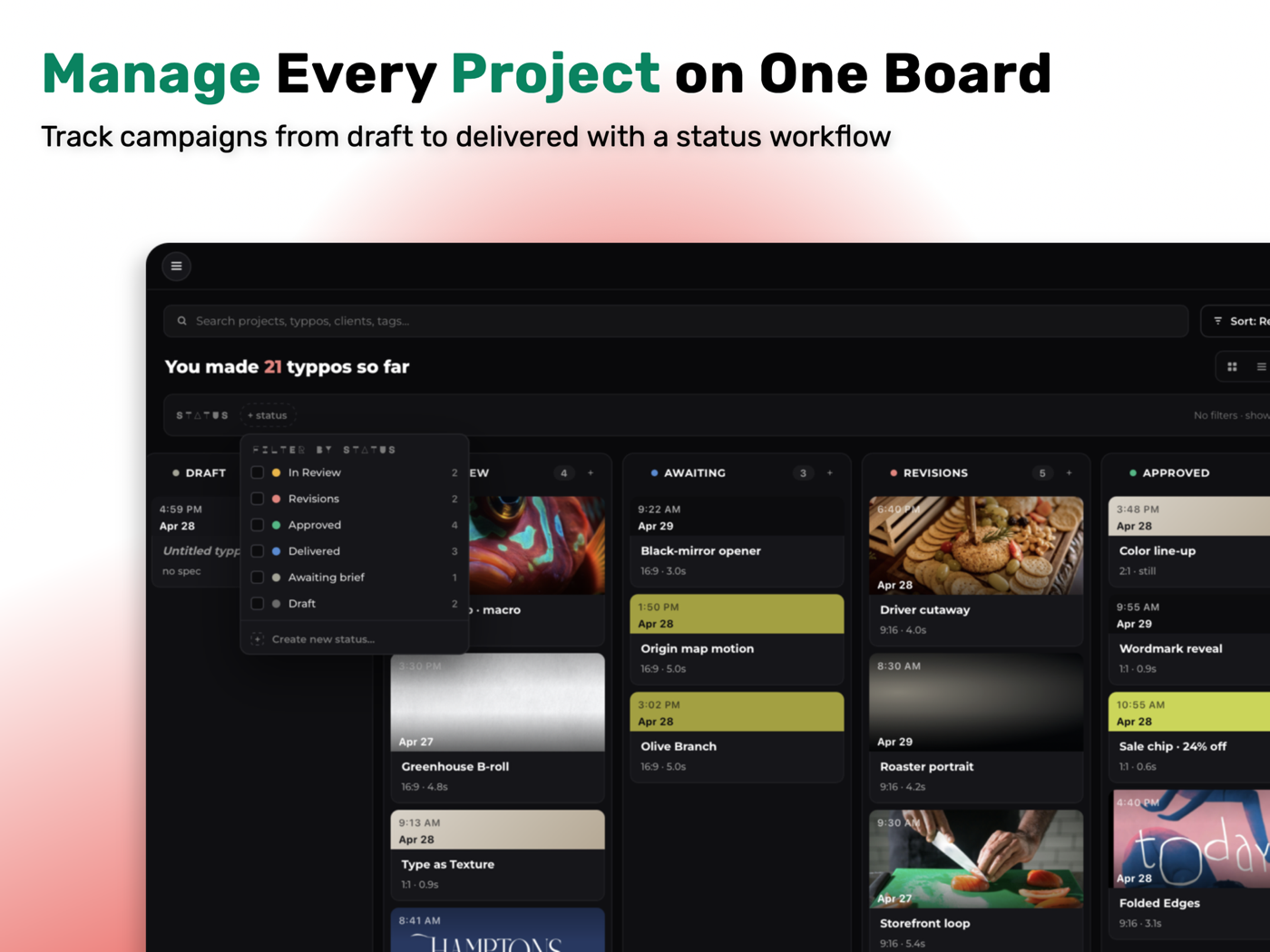
Typpo is designed for iPad and runs as the same build on Apple silicon Macs, macOS 14.6 and up. One codebase, one layout system, three screen sizes. These are the six iPad screenshots on the listing.
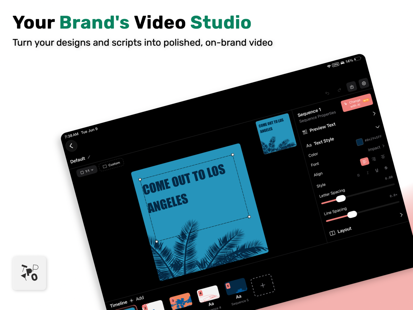
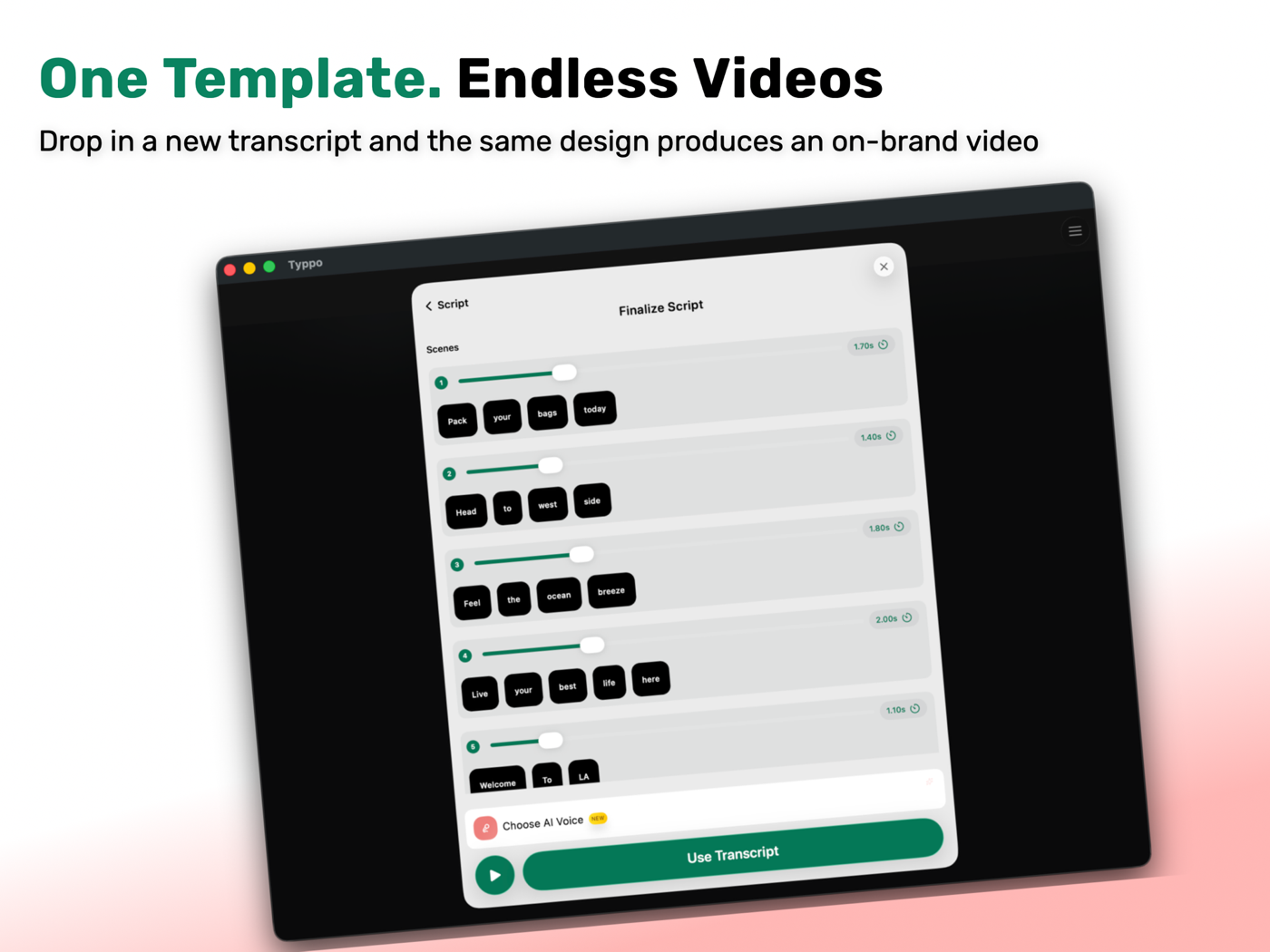
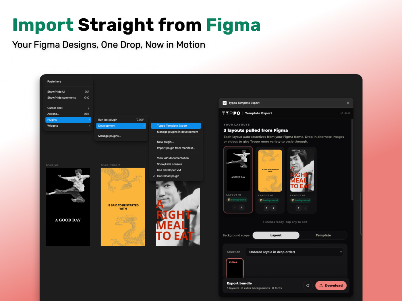
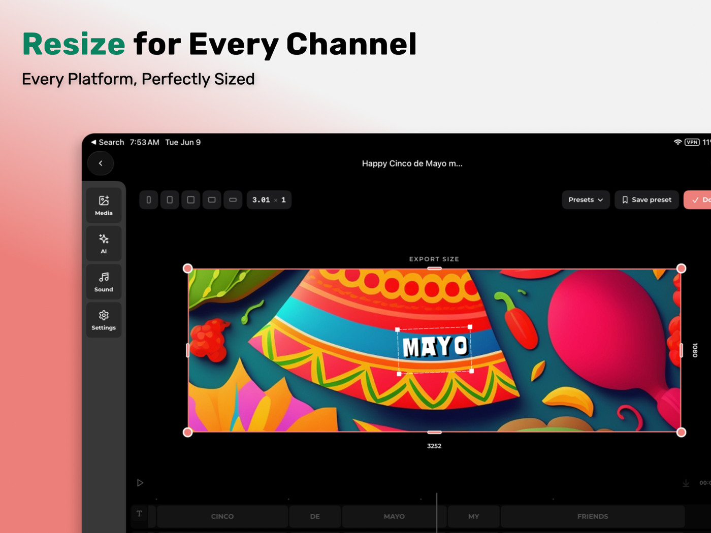
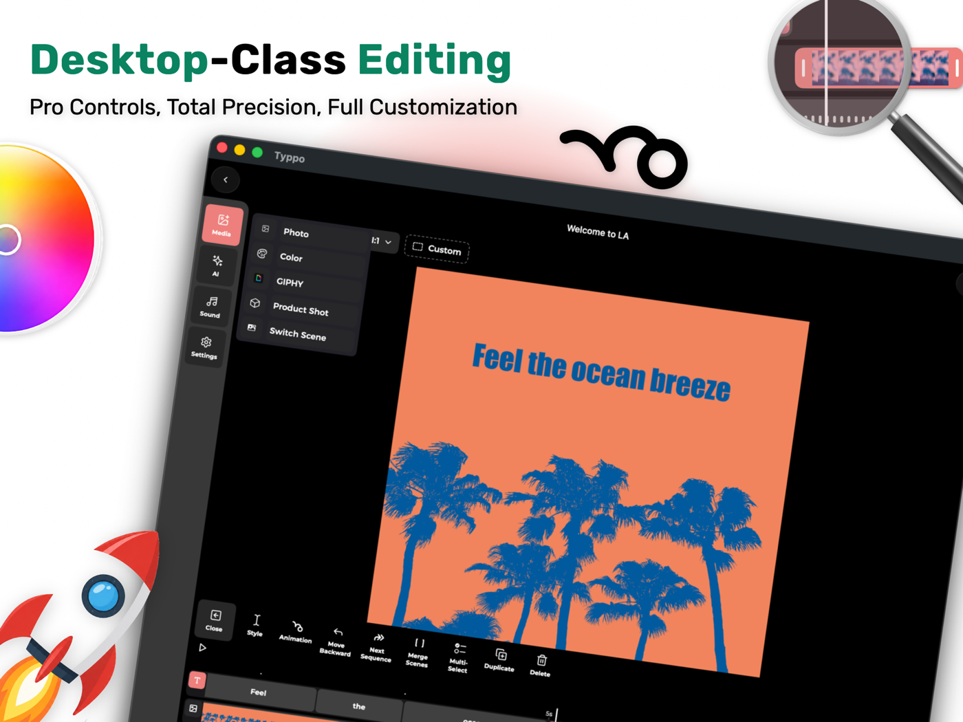
A video editor on a phone is a render pipeline first and an app second. The interesting work is in keeping that pipeline fast, predictable and testable while a team ships into it every week.
Transcription and word timing from Speech, type and motion laid out on a timeline, Metal effects and SceneKit scenes rendered into an AVFoundation composition, then exported at whatever size the post needs.
MVVM with a state, store and reducer per feature, dependencies injected, and a navigator and factory for every route, so a screen can be built and tested without the rest of the app.
Dev, QA, Beta and Prod schemes, Fastlane for builds and tests, SwiftFormat before every commit, SSL pinning on the network layer, and a credit system that gets audited.
A second iOS app, for authoring templates: preview groups, check every font, debug the type, and export the template data the main app consumes.
Every ad on this page, moving or still, is rendered from code: real screen recordings dropped into compositions written in TypeScript, so a new feature gets an ad the same week it ships.
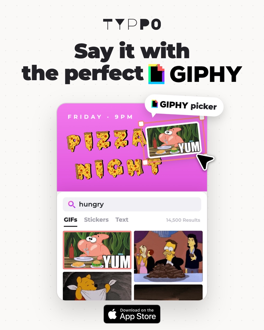
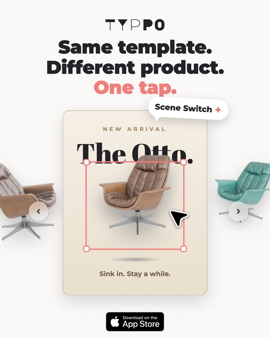
Typpo went up in April 2023 and has kept going: version 2.0.9 shipped in September 2026, with custom templates, prompt-to-animation and a Kanban board for projects. It is the one on this page I am working on right now.
I’m happy to walk through the pipeline, the template system, or how the team works.
Sessions recorded as they happen, each one a labelled example of a punch type.
The training set is only as good as its labels, so this is the slow, honest part.
Pick the classifier, point it at the data, and read the confusion matrix to see which types it still mixes up.
The model goes into the app as a file. Core ML runs it on the device, and the app reacts to the result as the punch lands.
Create ML replays a session on the left and calls each punch as it lands. On the right, what the model is actually looking at.
Vision finds the joints in every camera frame. A short window of those points, not the video itself, goes to the classifier, so the room, the light and the clothes don’t matter.
A Create ML action classifier, trained for 80 iterations on my own recordings of each punch.
I’m happy to talk through the data, the training, or how the model fits into an app.
The app explains itself in three steps. These are those steps, in its words, with its art redrawn for the page.
Every tool does one thing, and does it well. No menus, no toolbars, no clutter to wade through.
When one tool finishes, we suggest what’s natural next. Save the chain and replay it forever.
Your saved Relays sit at the top of the app, ready to rerun on a new file. The same five-step edit you used to do by hand, now one tap.
Each one is a few tools in a row, saved. The names are the app’s own.
Snap a photo, see what to pay and what to sell for.
Turn your pet’s photo into a high-contrast MISSING poster.
Photograph a pricey find, get affordable lookalikes.
Paste a social link, get a clean recipe card to cook from.
A flyer, a text, a booking. One tap and it’s on your calendar.
Snap a business card or an email signature. It lands in Contacts.
A handwritten list, a whiteboard, a text. Every item becomes a reminder.
Snap a homework problem. Get a slideshow that teaches the concept.
Every tool takes one input and does one thing, so any output can feed the next tool in line.
Apple Intelligence through the Foundation Models framework for the reading, extracting and summarising, with MLX as a second engine for local models when a task wants one.
Foreground instance masks and person segmentation from Vision drive the cut-outs, blurs and replacements, frame by frame for video.
Captions and transcripts come from the on-device speech analyzer, then get burned into the video with AVFoundation.
A share extension and App Intents mean a Relay runs from the share sheet, from Shortcuts, or on whatever is on the clipboard.
Relay isn’t out yet. If you’d like to try a build before it is, say so.